External Brief
- remicatchpole
- Nov 17, 2021
- 3 min read
Updated: Dec 2, 2021
This blog post gives a brief overview of my external brief project. This includes client, audience, and project research. This research analysis has allowed me find benchmarks to work to the correct standard, as well as gain further insight into my project.
Brief synopsis
A product and marketing model of a beer pump with a new font and logo design to be handled by the client and used as a font model for consumer testing.
The font design must attract the core target audience of 18-35 year old men.
It must function in a light airy venue as equally as a dark club environment.
The font badge lens and handle must be branded with 2D graphics for their core “N&K Sundown Lager” which is a light refreshing 4.0% pilsner.
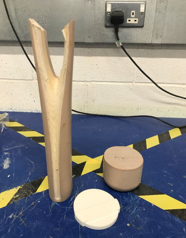
The picture below is the original beer pump supplied by Berry Place for me to
replicate the model and create my own font and logo design over.

Client research
Frayser Reynolds
Fraser Reynolds is originally one of Berry Place’s clients, but as I have been in contact with Berry Place, they have offered me for him to be my client for this project. Fraser is a talented structural designer with enormous experience in development and
manufacture. He worked freelance for some time before creating his own company, called Ettle.

Berry Place Models Ltd
Berry Place is a very well established Model-Making firm based in Kent. They offer a
wide range of creative services including photo-realistic rendering, 2D and 3D
computer aided modelling, and materials development. They add form, colour and structure to bring original ideas to life.
Their highly motivated and skilled team have been providing 3D solutions to all areas of the creative industry for more than twenty years. The diverse range of clients they serve
includes product and packaging designers, advertising agencies, manufacturers, exhibition designers, photographers and entrepreneurs.

Audience research
The font and logo design on the beer pump model needs to attract the core target audience of 18-35 year old men. The most common places of hospitality for this age bracket includes clubs, bars, and pubs. Meaning that the font design must function in both light and dark environments. This also means that the font design will be a lot more effective if it is eye catching, vibrant, and bold. Using trendy and popular colours should help make the beer more desirable too.


Pop up bars at festivals for instance are also very popular within this age bracket due to popularity of the music and the artists, this brings a lot of opportunity for these bars. However, there are many different pop up bars inside of one festival, this creates a lot of competition between brands. Therefore, having a unique font and logo design is a key factor in the success and popularity of an alcoholic beverage. Using the trendy and popular font types for this age bracket would work particularly well. Currently the trend is shifting towards simpler and bolder font types in general.


Project research
Creating an effective font and logo design for the branding of the beer pump requires a combination of originality and influence. Furthermore, producing a successful model is also reliant on the materials and finishes used.


The design of the beer pump model is also dependant on the environment it is situated in. For example, a beer pump will be more effective in a club if the text on the badge lens lights up. A beer pump with a varnished wood material finish will work well with the aesthetic of an antiqued pub. However, as previously mentioned, my model will need to to be adaptable to both a light airy venue as well as a club environment. This means that the design and the materials used for the model will need to be suitable for both conditions.

These are primary research images of beer pumps that I have gathered. They are
situated in their environments, giving me context to these images, and allowing me to gain some influence from these designs.


These images also give me the correct conventions and bench-marking for my
model. The main bench-marking points being completing to a high quality material finish to the accurate shape and dimension. The main conventions being
using the appropriate font and logo design and materials for both environments, the model also has to be both durable and transportable, meaning that the
materials used need to be lightweight and long-lasting.


Comments